
Product photos: what changes with a consistent background
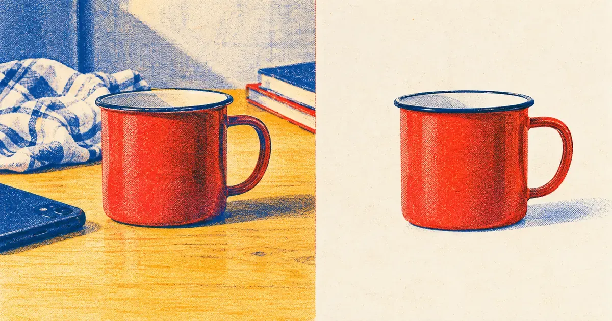
Photo: Avila Ops Tecnologia
When every store photo has the same background, lighting, and framing, customers compare products instead of photos. The store looks like a store, not a phone album. Google, marketplaces, and Instagram accept the image without complaint. A consistent background is one of the cheapest branding decisions.
The photo is the only thing customers “touch” before buying. A kitchen-table photo, a bed photo, a store photo with another product behind: each says “improvised.” Customers do not put it into words; they simply trust less and ask more.
What does a consistent background change?
From most visible to least:
- A uniform display. Twenty products on a category page with white backgrounds look like a collection. Different backgrounds look like twenty ads from different sellers.
- Customers compare size and color. With consistent framing, one mug is visibly larger. Unrelated photos make that impossible.
- Photos work everywhere. Mercado Livre and Amazon require white backgrounds for main images; Google recommends white or neutral. Instagram ads and WhatsApp catalogs accept the same photo. Shoot once.
- The product gets focus. Without objects behind it, eyes go directly to the item for sale.
- Switching products is quick. Same setting, light, and position: photograph 30 items in a morning.
That is why what a product listing is puts photos first.
Which background should I choose?
Each has a purpose:
| Background | Use | Caution |
|---|---|---|
| Plain white | Main photo, marketplaces, Google Shopping | Needs good light to avoid looking gray |
| One brand color | Own store, Instagram, collections | Unsuitable as marketplace main image |
| In-use setting (set table, body, room) | Second or third listing photo | Keep the same setting within a category |
Use white or neutral for the main photo, a setting afterward. The display stays uniform and listings show the product in use. If your brand has a defined color, use it in the second photo; consistent colors across the site, Instagram, and packaging create recognition, as discussed in visual identity.
How can I standardize without a studio?
Repetition matters, not equipment:
- Choose a fixed spot at home or in the store near a window and keep it.
- Buy large white poster board or background paper on a roll. Curve it between wall and table without a crease, hiding the floor line.
- Tape marks on the floor for the tripod or phone support and on the table for the product.
- Always shoot at the same time of day for similar light.
- Edit all photos with the same crop, brightness, and aspect ratio (square is simplest for stores and Instagram).
Background removal tools such as paid Canva Pro or free phone apps help existing photos with poor backgrounds. They make mistakes with hair, glass, and plush; inspect individually. For lighting and framing, see photographing products with a phone and window light.
What to do now
Open your category page and look from a distance. If backgrounds differ, choose the ten bestsellers and reshoot today in the same place with the same paper. Your brand consistent on Instagram, website, and invoice: avilaops.com/identidade-visual or WhatsApp: wa.me/5517997811471.
Frequently asked questions
Must product photos have white backgrounds?
Preferably the main one: Mercado Livre and Amazon require white, Google recommends neutral, and the display stays uniform. Other listing photos can show the product in use.
Can I remove backgrounds with an app?
Yes. It works well for simple outlines. Fringed clothing, glass, fine jewelry, and hair often look cut out; photograph those on the right background initially.
What is the ideal product photo size?
Square, at least 1,000 pixels per side, works for stores, Instagram, and most marketplaces. Keep a higher-resolution original for ads and printing.
Turn what you learned into your next step.
Tell us about your company and what you want to improve. We can explore the right tools, integrations or custom project together.